Develop User Empathy and Craft Better Products: Using Machine Learning to Analyze User Feedback via Clustering & Sentiment Analysis
Human-Centered Design and its importance in creating impactful products:
“Design thinking is a human-centered approach to innovation that draws from the designer’s toolkit to integrate the needs of people, the possibilities of technology, and the requirements for business success.” Tim Brown, Executive Chair and Former CEO of IDEO
Design thinking provides a framework to solve problems, and build innovative products. The design thinking approach is anchored in developing deep empathy for the user and their needs. Design thinking creates new and surprising insights and reduces entrenched biases that prevent action, thereby unleashing innovation. Instead of relying only on insights from trends in historical data or instincts, design thinking helps us make decisions based on what customers really want.
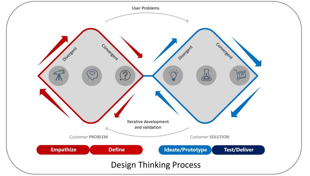
As shown in the picture above the design thinking framework is a series of divergent and convergent steps. During divergence researchers are exploring, developing understanding, and creating choices. During convergence, researchers are doing hypothesis validation and making choices. Overall design thinking can be broken down into the following five phases:
- Empathize: This is the discovery phase. In this phase, researchers spend time developing empathy for users through user research. The goal for this phase is to understand users, their needs, challenges, and context. Qualitative methods like interviews, ethnographic studies, and observations are often used to gain a deep understanding of users in their natural environments. User research often involves 1:1 conversations with users, observing users performing relevant actions, and doing qualitative survey/feedback analysis.
- Define: In this phase, the goal is to find the right problem to solve and develop a problem statement i.e. articulate the user’s needs, problems, and insights. A well defined problem that is urgent (user need), important (value to the user), and prevalent (common pain point for user segment). Both qualitative and quantitative insights from the empathize phase are distilled down to define the user problem. Quantitative data (like survey results) can help validate the scale or magnitude of a problem, while qualitative data can ensure the problem statement is nuanced and well-understood. “How Might We” is a common framework used in this phase to rephrase user problems into a goal oriented and actionable challenge statement.
- Ideate: This phase is about generating a wide range and large volume of ideas to find possible novel solutions. This phase is highly qualitative. While brainstorming solutions, feedback from user interviews, focus groups, or stories can inspire innovative solutions that might not have been considered from just the quantitative data. “How Might We” is a common framework used in this phase to brainstorm and develop a wide variety of innovative ideas.
- Prototype: The next step is to do rapid prototyping and validate solutions that are fit for users. The goal is to create a scaled-down version of the solution for testing purposes without significant investment of time and resources. These prototypes vary from simple sketches on sticky notes to low fidelity or high fidelity mock up, to a hacky working prototype. Prototypes are often put in front of a small group of users to gather initial reactions, and feedback, and identify glaring issues. Qualitative methods are used to analyze the feedback.
- Test: This phase is about testing with end users and gathering feedback in an iterative manner. The goal is to validate the prototype with a larger audience. This often involves agile mythologies to develop the product iteratively. Both Qualitative and Quantitative methods are used in this phase. Usability testing, where users interact with the prototype and provide feedback, gives detailed insights into specific issues or improvements generally based on qualitative feedback. A/B testing, surveys, and product analytics used to validate the effectiveness of the solution are quantitative methods.
As you can see above the exploratory diverging and converging nature of design thinking involves various types of qualitative and quantitative research.
Quantitative vs Qualitative: Value of machine learning in Design Thinking
Quantitative research relies on numerical data and statistical methods to derive insights. Tools commonly associated with this approach include product analytics, user surveys, multivariate testing, and heatmaps. This form of research is great for drawing overarching conclusions, identifying patterns, and making predictions based on large datasets. However, while it provides a broad overview, quantitative research might not capture deeper insights such as the nuances of user behaviors or feelings.
Qualitative research focuses on capturing human experiences and emotions. Instead of numbers, it focuses on words, images, or objects. Methods such as ethnography and observation are commonly used. This approach aims to grasp users’ motivations, feelings, and perceptions. Unfortunately, it’s very time-consuming to conduct and analyze qualitative research and therefore can’t be easily scaled.
Quantitative research solidifies and quantifies our existing knowledge (“knowns – knowns”). It addresses the “known-unknowns” by statistically exploring areas where we’re aware of knowledge gaps. However, its structured approach overlooks the “unknown-unknowns” that aren’t immediately apparent in numerical data. Qualitative research, through open-ended queries and immersive techniques, dives into the “known-unknowns” and the “unknown-unknowns.” It can unearth unexpected insights and bring to light user needs or sentiments that were previously unknown.
Machine learning techniques like Sentiment Analysis and Clustering can help alleviate the pain of time consuming manual analysis of qualitative research. These methods can process vast amounts of qualitative data quickly, and identify patterns, sentiments, or themes. By leveraging these techniques, researchers can also minimize personal biases and ensure that the analysis is more grounded in actual data.
Therefore by using Machine Learning Methods organizations can scale quantitative analysis and gain insights which are not possible by only doing quantitative analysis.
Now let’s go through an example of applying machine learning techniques in the real world.
Integrating Machine Learning into Design Thinking
Real-world example – Case Study: Analyzing user feedback for Headspace App on Apple App store and Google Play store
For demonstration purpose I chose an example of Headspace App on Apple App Store and Google Play Store. App store reviews are good source of user feedback which can used in place of qualitative data gathered from user interview during the empathy phase of design thinking.
Step 1 is to set up the environment and import relevant libraries.
# Let's make sure all the needed packages are installed
! pip install pandas scikit-learn vaderSentiment seaborn matplotlib plotly nltk wordcloud requests app-scraper app-store-scraper google_play_scraper spacy gensim sentence-transformers numpy

# Let's import packages and libraries

import pandas as pd
import plotly.express as px
import matplotlib.pyplot as plt
import os
import nltk
import seaborn as sns
import numpy as np

from sklearn.feature_extraction.text import TfidfVectorizer
from sklearn.cluster import KMeans
from sklearn.manifold import TSNE
from sklearn.compose import ColumnTransformer
from sklearn.preprocessing import StandardScaler, OneHotEncoder, MinMaxScaler
from sklearn.feature_extraction.text import TfidfVectorizer
from vaderSentiment.vaderSentiment import SentimentIntensityAnalyzer
from google_play_scraper import app, reviews_all, Sort, reviews
from app_store_scraper import AppStore
from nltk.corpus import stopwords
from wordcloud import WordCloud, STOPWORDS, ImageColorGenerator
from bs4 import BeautifulSoup
from string import punctuation
from collections import Counter
from heapq import nlargest
from sklearn.metrics.pairwise import euclidean_distances
from collections import Counter
import re
Next let’s create the data set to analyze by downloading 1,000 user reviews each from both Apple app store and Google play store. I download date, review text, and rating from app store and then augment the data by adding two more attributes – 1. source – apple app store or google play store and 2. review text length.
# Download Apple App Store Review
# App store ID for Headspace: Mindful Meditation on the US App Store
app_store_id = "493145008"
app_store_app = AppStore(country="us", app_name="Headspace", app_id=app_store_id)
# fetching 1000 reviews
app_store_app.review(how_many=1000)

# Create dataframe from reviews
df_app_store = pd.DataFrame(app_store_app.reviews)
df_app_store['Source'] = 'App Store'
df_app_store = df_app_store[['date', 'review', 'rating']]
df_app_store.columns = ['Date', 'Review_Text', 'Rating']
df_app_store['Source'] = 'Apple App Store'
df_app_store['Review_Length'] = df_app_store['Review_Text'].apply(len)
# describe the data in app store review
print(df_app_store.describe())
# store Apple App Store review the data in a csv file
df_app_store.to_csv('Headspace_appstore_reviews.csv', index=False)

# Google Play Store review download
# package name for the app for Headspace: Mindful Meditation on the US Google Play Store
app_id_play_store = "com.getsomeheadspace.android"
# fetching 1000 reviews
count = 1000
result, continuation_token = reviews(
    app_id_play_store,
    count=count,
    lang='en',
    country='us',
    sort=Sort.MOST_RELEVANT
)
df_play_store = pd.DataFrame(result)
df_play_store = df_play_store[['at', 'content', 'score']]
df_play_store.columns = ['Date', 'Review_Text', 'Rating']
df_play_store['Source'] = 'Google Play Store'
df_play_store['Review_Length'] = df_play_store['Review_Text'].apply(len)
# describe the data in google play store review
print(df_play_store.describe())
# store google play store review data in a csv file
df_play_store.to_csv('Headspace_playstore_reviews.csv', index=False)

# Combine both dataframes from apple app store and google play store
df_Headspace_reviews_combined = pd.concat([df_app_store, df_play_store], ignore_index=True)

# store combined review data from apple app store and google play store in a csv file
df_Headspace_reviews_combined.to_csv('Headspace_AppStore_PlayStore_Combined_reviews.csv', index=False)

# Load the combined CSV into a data frame can be starting point in case you already have the data
df = pd.read_csv('Headspace_AppStore_PlayStore_Combined_reviews.csv')
Next I clean the review text column as user reviews often contains some special characters. But this step is not required. The process and code will work even if the review text is not cleaned up.
# clean the review data - remove new line and special characters
def clean_text(text):
    # Replace newline characters with space
    text = text.replace('\n', ' ')
    # Remove special characters
    text = re.sub(r'[^a-zA-Z0-9\s]', '', text)
    # Replace multiple spaces with a single space and strip trailing and leading spaces
    text = ' '.join(text.split()).strip()
    return text

# Apply the clean_text function to the 'Review_Text' column
df['Review_Text'] = df['Review_Text'].apply(clean_text)
# Save dataframe to a CSV file to clean the csv
df.to_csv('Headspace_AppStore_PlayStore_Combined_reviews.csv', index=False)
Sentiment Analysis:
For sentiment analysis I am using SentimentIntensityAnalyzer method which is part of vaderSentiment library. it’s designed to analyze sentiments in English text, particularly for short pieces of text like tweets or reviews. “VADER” stands for “Valence Aware Dictionary and sEntiment Reasoner.” VADER is particularly useful for sentiment analysis on social media or other short text where context, emojis, and slangs play a crucial role. You can learn more about it here.
For this analysis I wanted granular sentiment analysis and therefore I categories it into five categories from Strongly Negative to Strongly Positive.
# Sentiment Analysis using VADER
analyzer = SentimentIntensityAnalyzer()
# Calculate sentiment scores and classify as strongly positive, positive, neutral, negative, or strongly negative
df['Compound'] = df['Review_Text'].apply(lambda x: analyzer.polarity_scores(str(x))['compound'])
df['Sentiment'] = df['Compound'].apply(lambda x: 'Strongly positive' if x > 0.6 else ('Positive' if 0.2 <= x <= 0.6 else ('Neutral' if -0.2 <= x <= 0.2 else ('Negative' if -0.6 <= x <= -0.2 else 'Strongly negative'))))
Clustering:
For clustering I am using KMeans which is common clustering algorithm.
Since we need to cluster text data, before I can use KMeans, I need to convert the text data into numerical value. I used Term Frequency-Inverse Document Frequency (TF-IDF) to convert the review text into numerical vector. TF-IDF technique gives numerical vectors for text data where the value increases proportionally to count, but is offset by the frequency of the word in the entire dataset. Words that are common across all documents will have low or even zero scores, while unique words get a high score.
I then use KMeans for clustering. KMeans algorithm works to minimize the within-cluster sum of squares or the variance within each cluster. I am creating 4 clusters here because from rating data we already have 5 ratings (from 1 to 5) which is a type of cluster and I thought 3 clusters were too few for analysis. We can use the elbow method which is used to determine the optimal number of clusters in KMeans clustering by finding the number of cluster after which adding more clusters doesn’t provide much better fit to the data but for the purpose of this analysis playing around with three to five clusters provided me the desired result.
# Term Frequency-Inverse Document Frequency (TF-IDF) Vectorization
tfidf_vectorizer = TfidfVectorizer(ngram_range=(1, 3),stop_words='english', max_df=0.85)
tfidf_matrix = tfidf_vectorizer.fit_transform(df['Review_Text'].fillna(''))
# KMeans Clustering
# Create 4 clusters
num_clusters = 4
km = KMeans(n_clusters=num_clusters, random_state=0)
df['Cluster_KMeans_tfidf'] = km.fit_predict(tfidf_matrix)
Exploratory data analysis
Now as we have completed sentiment analysis and clustering, next step is to analyze the data to see if there are patterns and themes we can identify from each of these clusters.
The first step I used is to visualize these clusters. Due to dimensionality reduction this is not particularly useful but hovering over each of the dot in scatter plot is a quick way to do a quick exploration of these clusters.
# t-Distributed Stochastic Neighbor Embedding t-SNE Visualization
tsne = TSNE(n_components=2, random_state=0)
reduced_data = tsne.fit_transform(tfidf_matrix.toarray())
df['X'] = reduced_data[:, 0]
df['Y'] = reduced_data[:, 1]

# Visualize Clusters with Plotly
fig_cluster = px.scatter(df, x='X', y='Y', color='Cluster_KMeans_tfidf', hover_data=['Review_Text', 'Rating', 'Sentiment'],
                         color_continuous_scale=px.colors.sequential.Viridis, title='t-SNE Clusters of Reviews')
fig_cluster.show()

# Visualize Sentiment with Plotly
fig_sentiment = px.scatter(df, x='X', y='Y', color='Sentiment', hover_data=['Review_Text', 'Rating', 'Cluster_KMeans_tfidf'],
                           color_discrete_map={'Positive': 'green', 'Neutral': 'yellow', 'Negative': 'red'},
                           title='t-SNE Sentiments of Reviews')
fig_sentiment.show()
Word Cloud and Frequent terms in cluster:
I find word cloud to be one of the quickest and most useful way to identify common themes in quantitative data.
In following code snippet I find out 5 most frequent terms from each cluster and create a word cloud for each cluster. Combining these two helps us infer major theme from each cluster.
# Map the features back to the clusters
df_tfidf = pd.DataFrame(tfidf_matrix.toarray(), columns=tfidf_vectorizer.get_feature_names_out())

# Add the cluster column
df_tfidf['Cluster'] = df['Cluster_KMeans_tfidf']

# Group by cluster and get the mean for top terms
cluster_top_terms = df_tfidf.groupby('Cluster').mean()

print(cluster_top_terms)

# Save the dataframe with added sentiment and cluster columns
df.to_csv('Headspace_AppStore_PlayStore_Combined_reviews_with_sentiments_clusters.csv', index=False)

# setting up for word cloud
height = 1200
width = 1920
max_words = 500
# Creating stop words to exclude words which dont add value to cluster analysis
stop_words = set(STOPWORDS)
stop_words.update(["app", "Headspace", "headspace","use","ve","just","great", "really", "good"])

# Extract top 5 topics/terms for each cluster
order_centroids = km.cluster_centers_.argsort()[:, ::-1]
terms = tfidf_vectorizer.get_feature_names_out()

for i in range(num_clusters):
    print(f"Top 5 terms for Cluster {i}:")
    count_terms = 0
    for ind in order_centroids[i, :]:
        if terms[ind] not in stop_words:
            print(f" - {terms[ind]}")
            count_terms += 1
        if count_terms == 5:
            break
    print()


# Number of unique clusters
num_clusters = df['Cluster_KMeans_tfidf'].nunique()

for cluster_num in range(num_clusters):
    # Extract reviews of the current cluster
    cluster_reviews = df[df['Cluster_KMeans_tfidf'] == cluster_num]['Review_Text'].fillna("").str.cat(sep=' ')

    # Generate word cloud
    wordcloud = WordCloud(width=width,height=height, background_color = 'white', max_words=max_words, stopwords = stop_words).generate(cluster_reviews)

    # Display the word cloud
    plt.figure(figsize=(10, 7))
    plt.imshow(wordcloud, interpolation='bilinear')
    plt.axis('off')
    plt.title(f"HeadSpace_Word Cloud for Cluster {cluster_num}")
    plt.show()
    print("\n \n")

    # save it as png file
    wordcloud.to_file(f"HeadSpace_word_cloud_cluster_{cluster_num}.png")
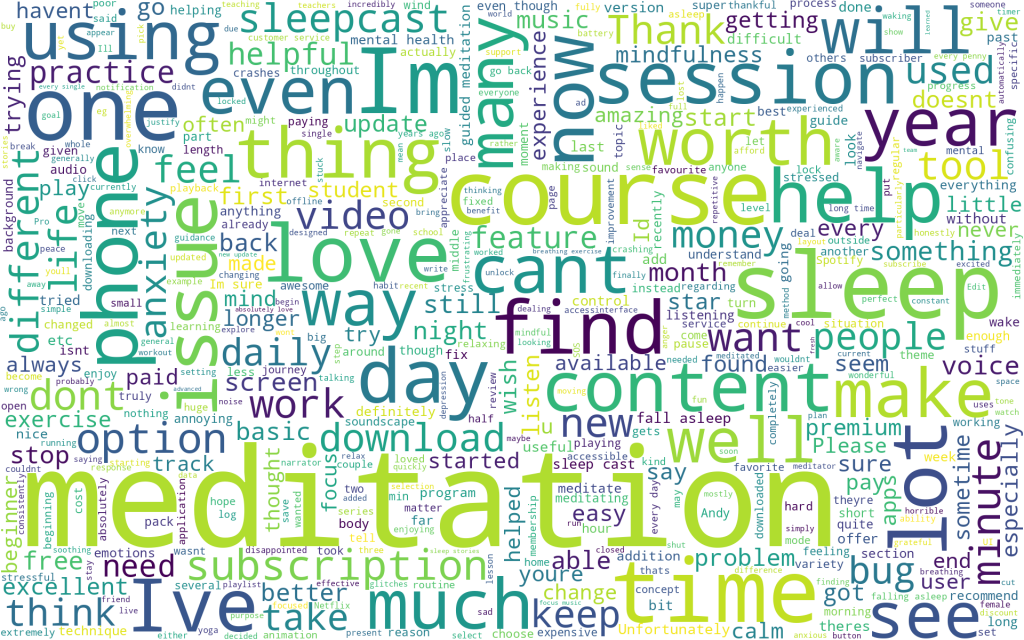
Quick look at the most frequent terms in each cluster shows the cluster #1 is most likely group of users who were annoyed by subscription fee for the app. Meditation is common theme across all the clusters – no surprise since we are talking about Headspace which is an app for mindfulness. Cluster #0 seems to have a theme of courses and sleep which is also present in cluster #3.
Top 5 terms for Cluster 0:
 - meditation
 - courses
 - sleep
 - phone
 - im

Top 5 terms for Cluster 1:
 - free
 - subscription
 - trial
 - pay
 - free trial

Top 5 terms for Cluster 2:
 - meditation
 - life
 - ive
 - day
 - helped

Top 5 terms for Cluster 3:
 - meditation
 - love
 - meditations
 - sleep
 - dont
Word Cloud for Cluster #0:
Beyond the most frequent terms mentioned above some of the words which jumped out to me are: session, find, issue, and cant. This seems to suggest these could be users who may be having trouble finding contents.
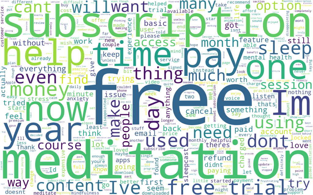
Word Cloud for Cluster #1:
This word cloud is pretty self explanatory isnt it? As we thought earlier, this cluster definitely seems to be focused on monetary aspects of the app. These are users who are looking for a free version of the app. Its likely that many of these reviewer didn’t cancel the subscription during trial period and got charged.
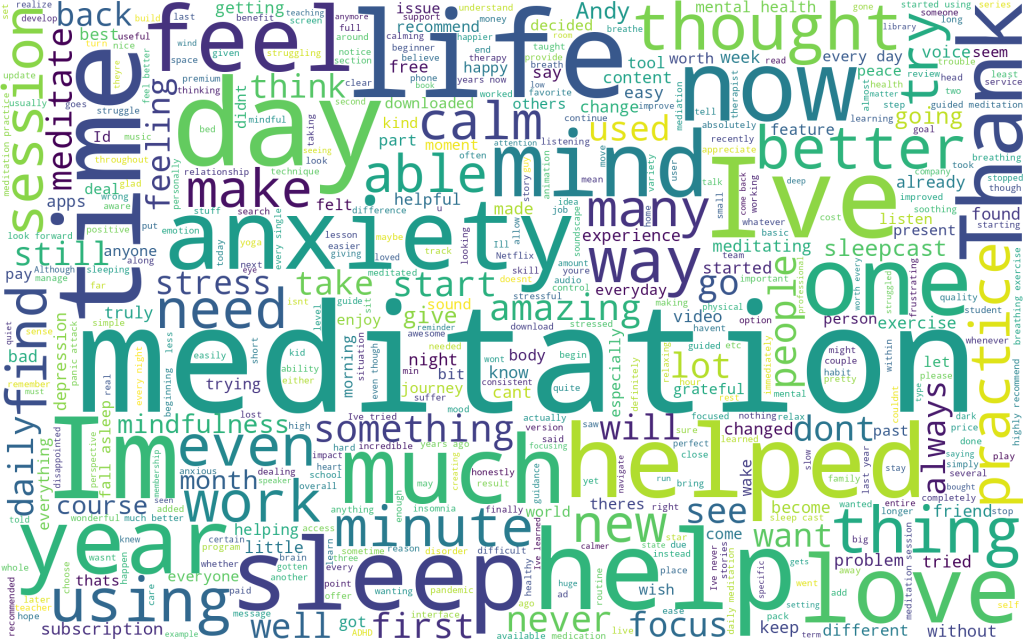
Word Cloud for Cluster #2
This cluster seems very positive. Thank, love, help seems like common theme. From visual analysis I think these are users who are very thankful to the Headspace app for helping them meditate and manage their anxiety.
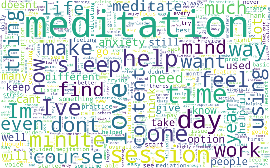
Word Cloud for Cluster #3
This cluster looks similar to cluster #2 above. However upon some more analysis I do see few other themes such as sleep, content, session, course, emerging. We will have to do more analysis of the review data to understand more about these users.
Quantitative Analysis:
Next let’s do some quantitative analysis on these clusters and sentiment analysis to understand these users more.
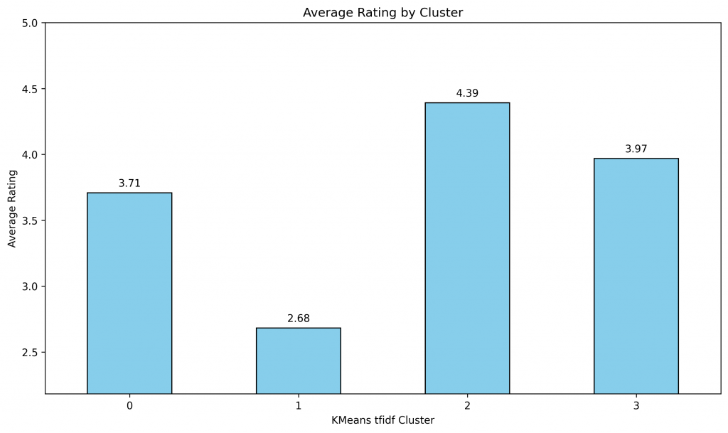
First I wanted to see if there is a correlation in between clusters and rating.
# Calculate the average rating for each cluster
average_ratings = df.groupby('Cluster_KMeans_tfidf')['Rating'].mean()
print(average_ratings)
average_ratings.to_csv('HeadSapce_AppStore_PlayStore_average_ratings.csv', index=False)

# Plot
plt.figure(figsize=(10, 6))
fig, ax = plt.subplots(figsize=(10, 6))
average_ratings.plot(kind='bar', color='skyblue', edgecolor='black')

# Title and labels
plt.title('Average Rating by Cluster')
plt.xlabel('KMeans tfidf Cluster')
plt.ylabel('Average Rating')
plt.xticks(rotation=0)
plt.ylim([min(average_ratings) - 0.5, 5])

for p in ax.patches:
    ax.annotate(f"{p.get_height():.2f}",
                (p.get_x() + p.get_width() / 2., p.get_height()),
                ha='center', va='center',
                xytext=(0, 9),
                textcoords='offset points')

plt.tight_layout()
plt.savefig("HeadSpace Average Rating by KMeans tfidf Cluster.png", dpi=300, facecolor='w', edgecolor='b', format='png', transparent=True, bbox_inches='tight')
plt.show()
Not surprisingly different clusters have different average ratings. It seems like Cluster #1, these were users who were unhappy about the fee of the app have lowest rating. Cluster #0 and #3 have simillar rating whereas cluster #2 is by users who absolutely love the app.
For next step I wanted to see if there was any correlation in between clusters, sentiment, and app store type. Following code creates a heatmap chart to show distribution and correlation.
# Cross-tabulation tables to do EDA on Cluster, Sentiment, Review and Source
cluster_sentiment = pd.crosstab(df['Cluster_KMeans_tfidf'], df['Sentiment'])
cluster_source = pd.crosstab(df['Cluster_KMeans_tfidf'], df['Source'])
cluster_rating = pd.crosstab(df['Cluster_KMeans_tfidf'], df['Rating'])

# Plotting
plt.figure(figsize=(14, 6))

# Plot for Cluster vs Rating
plt.subplot(1, 2, 1)
sns.heatmap(cluster_rating, annot=True, cmap="YlGnBu", fmt='g', cbar=False)

plt.title('User Ratings across Clusters')
plt.savefig("User Rating across Clusters.png", dpi=300, facecolor='w', edgecolor='b', format='png', transparent=True, bbox_inches='tight')

# Plotting
plt.figure(figsize=(14, 6))

# Plot for Cluster vs Sentiment
plt.subplot(1, 2, 1)
sns.heatmap(cluster_sentiment, annot=True, cmap="YlGnBu", fmt='g', cbar=False)

plt.title('Distribution of Clusters across Sentiments')
plt.savefig("Distribution of Clusters across Sentiments.png", dpi=300, facecolor='w', edgecolor='b', format='png', transparent=True, bbox_inches='tight')

# Plot for Cluster vs Source
plt.subplot(1, 2, 2)
sns.heatmap(cluster_source, annot=True, cmap="YlGnBu", fmt='g', cbar=False)
plt.title('Distribution of Clusters across Sources (App Store & Play Store)')
plt.tight_layout()
plt.savefig("Distribution of Clusters across Sources.png", dpi=300, facecolor='w', edgecolor='b', format='png', bbox_inches='tight', transparent=True)
plt.show()
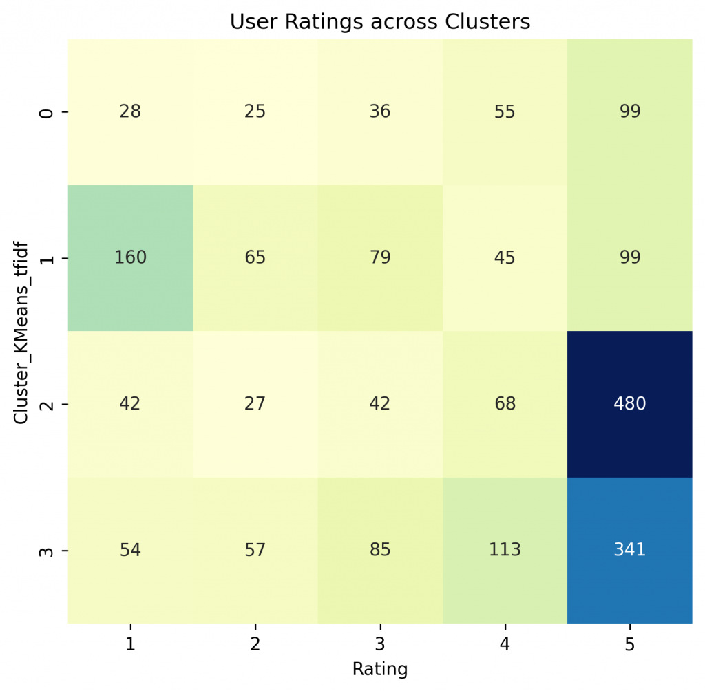
By analyzing user rating and cluster, we can see that Headspace has predominantly positive rating which is evident from numbers for rating 5. Cluster #1 has a lot of users who rated the app 1 which is understandable because these users are unhappy about subscription fee of the app.
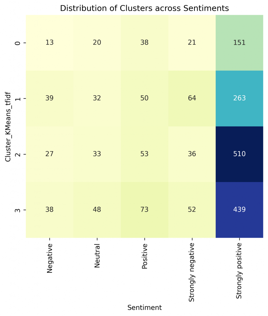
Sentiment analysis of review text and mapping to clusters shows that sentiments are mostly positive.
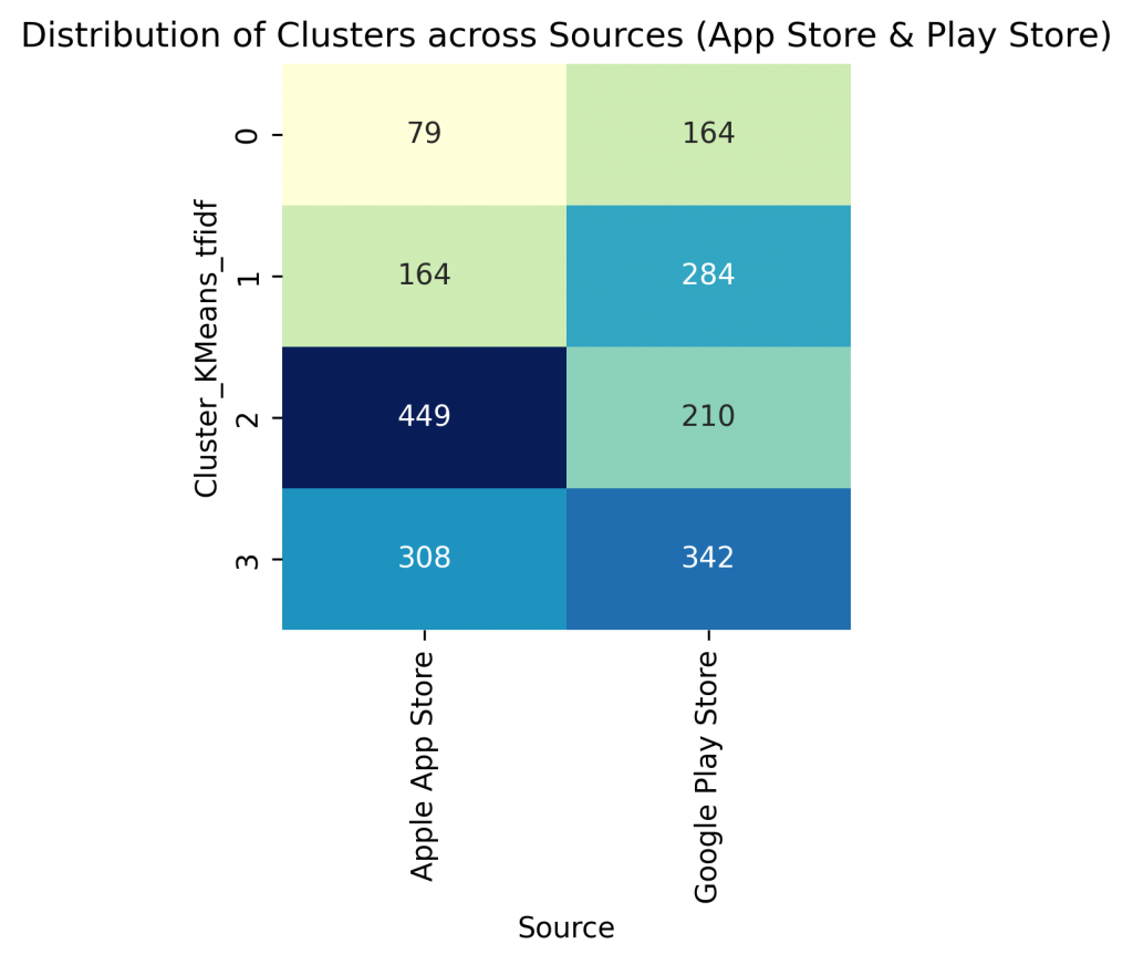
I was curious to know if there were differences in between user cluster in between Google Play store and Apple App store. As we can see Apple app store users predominantly fall in cluster 2 and 3. Both of these clusters have high average rations. Google play store however has a sizable number of users in cluster #1. This could be an indication of more price sensitive customers on Google play store, which makes sense because Apple iPhones are more expensive that average Android phones so the average user of Android phone could be more price sensitive user.
I also noticed that most of Android users fall into cluster 3 whereas most of the iPhone users fall into cluster #2.
For further strengthening our understanding on cluster and sentiment distribution among the userbase let’s do some more statistical analysis.
# Create a pivot table for cluster, sentiment, and source
pivot_table = df.groupby(['Cluster_KMeans_tfidf', 'Sentiment', 'Source']).size().unstack().fillna(0).astype(int)

# Display the pivot table
print(pivot_table)
pivot_table.to_csv('HeadSpace_AppStore_PlayStore_Review_pivot_table.csv', index=False)


# Cross-tabulation tables
cluster_sentiment = pd.crosstab(df['Cluster_KMeans_tfidf'], df['Sentiment'], margins=True, margins_name="Total")
cluster_source = pd.crosstab(df['Cluster_KMeans_tfidf'], df['Source'], margins=True, margins_name="Total")
sentiment_source = pd.crosstab(df['Sentiment'], df['Source'], margins=True, margins_name="Total")

# Display the tables
print("\nDistribution of Clusters across Sentiments:")
print("------------------------------------------")
print(cluster_sentiment)
print("\n\nDistribution of Clusters across Sources (App Store & Play Store):")
print("--------------------------------------------------------------")
print(cluster_source)
print("\n\nDistribution of Sentiment across Sources (App Store & Play Store):")
print("--------------------------------------------------------------")
print(sentiment_source)

# Normalize to get percentages
pivot_table_percentage = (pivot_table / pivot_table.sum().sum() * 100).round(2)

# Display the pivot table with percentages
print(pivot_table_percentage)
pivot_table_percentage.to_csv('HeadSpace_AppStore_PlayStore_pivot_table_percentage.csv', index=False)
# Convert counts to percentages
cluster_sentiment_percentage = (cluster_sentiment / df.shape[0] * 100).round(2)

# Display the table with percentages
print(cluster_sentiment_percentage)
cluster_sentiment_percentage.to_csv('HeadSpace_AppStore_PlayStore_cluster_sentiment_percentage.csv', index=False)
# Convert counts to percentages
cluster_source_percentage = (cluster_source / df.shape[0] * 100).round(2)

# Display the table with percentages
print(cluster_source_percentage)
cluster_source_percentage.to_csv('HeadSpace_AppStore_PlayStore_cluster_source_percentage.csv', index=False)
Selected output: (for detailed output check out the colab workbook by clicking here)
It seems like cluster #0 is the smallest cluster of users. Cluster #1 is second smallest but its fairly large so these customer’s shouldn’t be ignored.
Distribution of Clusters across Sentiments:
------------------------------------------
Sentiment   Negative  Neutral  Positive  Strongly negative  Strongly positive  Total
Cluster
0              13       20        38            21                 151         243
1              39       32        50            64                 263         448
2              27       33        53            36                 510         659
3              38       48        73            52                 439         650
Total          117      133       214           173                1363        2000

Distribution of Clusters across Sources (App Store & Play Store):
--------------------------------------------------------------
Source                Apple App Store  Google Play Store  Total
Cluster
0                                  79                164    243
1                                 164                284    448
2                                 449                210    659
3                                 308                342    650
Total                            1000               1000   2000


Distribution of Sentiment across Sources (App Store & Play Store):
--------------------------------------------------------------
Source             Apple App Store  Google Play Store  Total
Sentiment
Negative                        30                 87    117
Neutral                         21                112    133
Positive                        54                160    214
Strongly negative               51                122    173
Strongly positive              844                519   1363
Total                         1000               1000   2000
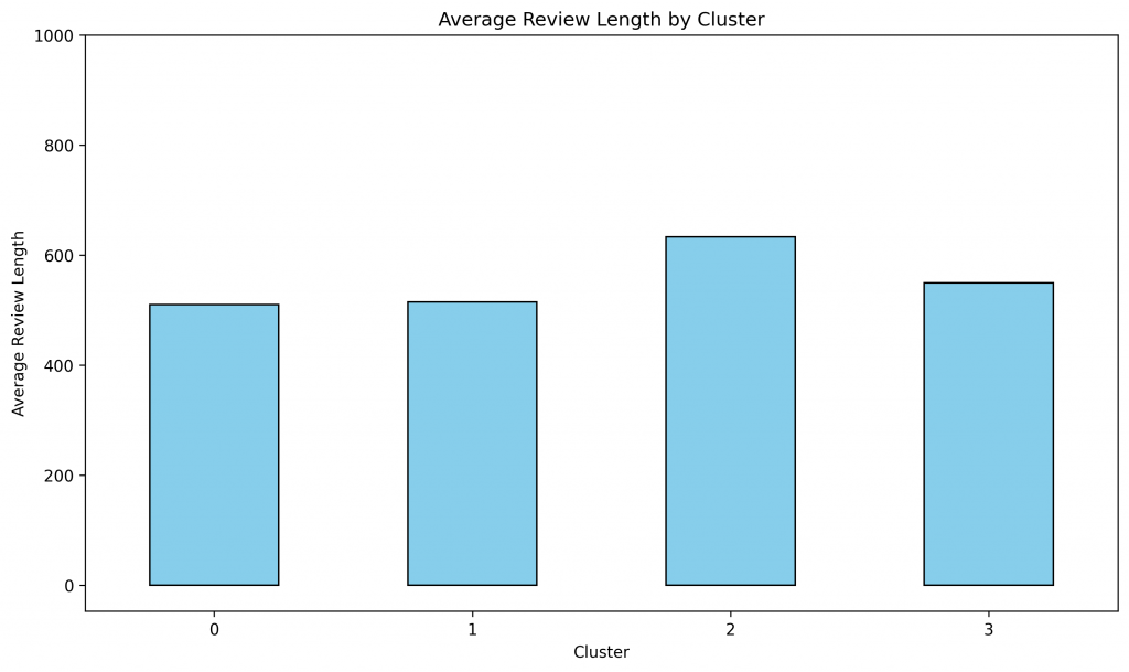
I was curious if there was any correlation in between length of review and cluster so following code checks for that.
# Calculate the average Review_Length for each cluster
average_Review_Length = df.groupby('Cluster_KMeans_tfidf')['Review_Length'].mean()
average_Review_Length.to_csv('HeadSpace_AppStore_PlayStore_average_Review_Length.csv', index=False)

# Plot
plt.figure(figsize=(10, 6))
average_Review_Length.plot(kind='bar', color='skyblue', edgecolor='black')
# Title and labels
plt.title('Average Review Length by Cluster')
plt.xlabel('Cluster')
plt.ylabel('Average Review Length')
plt.xticks(rotation=0)
plt.ylim([min(average_ratings) - 50, 1000])
plt.tight_layout()
plt.savefig("HeadSpace Average Review Length by Cluster.png", dpi=300, facecolor='w', edgecolor='b', format='png', transparent=True, bbox_inches='tight')
plt.show()
It seems like average review length is fairly simillar for all the clusters which cluster #2 users writing relatively larger review. Average review length of users in cluster #1 is similar to cluster #0 and #3 so it seems like unhappy customers do not write longer review, its the happiest users (cluster #2) who write longer reviews. Perhaps happy users have more to share about their experience compared to unhappy or moderately happy users.
For further analysis researcher should look into review text of cluster #0 and cluster #3 to find some deeper insights beyond what we could find from word cloud and most frequent terms.
With this high level insights and common themes across users I further analyzed review text by different clusters, sentiments and ratings. Some of my main findings are:
- There seems to be two main use cases:
- Users looking for meditation and mindfulness to reduce anxiety and stress. This user group is very happy with the app.
- Users looking for sleep. These users are not as happy as users looking for meditation. A lot of user from this segment could be classified for high risk of churn. These users are looking for more features and contents related to sleep cast.
- Main areas for improvement in usability:
- A lot of users show disappointment in user experience especially after a major update. Some of these are long term users. This is not a good news for the app.
- Monetization: As observed earlier, there is a large segment of customers who are going through tough time and are very stressed. A lot of times stress is induced by financial stress. These users are looking for a way to reduce stress but can not pay. Perhaps if Headspace came up with a advertisement based free version of the app it might work for these customers.
Closing Thoughts
By combining power of design thinking, quantitative research and machine learning, we can deepen our understanding of users. We can overcome a lot of analytical challenges with biases, time, and scalability of doing a qualitative user research by leveraging machine learning techniques. By effectively combining these techniques we can create a more informed user-centric product.
If you want to dive deeper into the code shared in the blog you can access the colab notebook by clicking here.
References:
- IDEO – Design thinking defined:
- Stanford d School:
- University of Southern California Marshall School of Business MBA Classes:
- MOR 564 – Strategic Innovation – Creating new markets by Prof. Violina Rindova


